Jesse and I sought out to produce a short film that told the story of how modern day media and technology can distract people. We shot the film in a very short time period knowing that we could make our footage work with the editing techniques we intended to use. The story followed myself arriving at Hunter College, seemingly late for class yet constantly distracted by phone calls, texts, conversations with friends, and even vending machines. The final product was edited into black and white, and accompanied by a 1920's style piano bar score that contrasted the context of the story.
My character is distracted by modern media and technology yet we showed this in classical throwback style. When shooting, our main goal was to make my journey through the school as seamless as possible. This meant story boarding every scene which helped maintain the 180 degree rule throughout the entire film. As can be seen in the film, the shots run very smoothly and integrate well with the piano bar score.
The decision to edit the film into black and white and exclude dialogue were vital to our conceptual goals. We replaced dialogue with text slides that often included jokes that added additional comedic value. We edited the text slides right after a specific shot to act almost like a punch-line. The shot would be shown and the text would follow and make a joke about what was just seen.
During pre-production, we conceptualized everything that we wanted the film to be, thus the post-production process didn't spark any notable changes to what we were trying to do.
When we showed the film to the class, it was enjoyed by mostly everyone because it was very easy to follow and it was something that everyone can relate to, especially as Hunter students. Our main goal was to offer a narrative on modern day media distractions in a classical film style and this is exactly what we produced.
If we were to do the film over, the only notable change that we would make would to be shoot more footage to make the editing process easier. At times, we had to really work to make shots appear seamless and flow with the smoothness we wanted, and more footage would have made that easier.
Tuesday, April 13, 2010

Tuesday, March 2, 2010
Editing Emotion
Editing is one of the most single important processes when developing linear media, especially within film productions. The above piece is a short fan made trailer for the upcoming World Cup in South Africa. It serves as a great example of how effective editing can evoke emotion and drama.
The trailer starts with a dimly lit shot of the World Cup trophy rotating against a dark background. The score is a short tempo melodramatic violin piece that gives the viewer dramatic emotions. The initial shots fade in and out with different views of the golden trophy, until golden text comes up in a side by side shot that says "The Greatest Battle in the World". The viewer now gets a sense for the serious perspective that the trailer is trying to grasp.
The next series of shots are of a stadium filled with fans, that inter-cut shots of close ups to show the emotion on the people's faces. The piece continues with the progression of the violin score and inter-cutting shots of the trophy rotating with more text beside it. Phrases like "All Players will try to prove themselves this year" and "There is no coming back" show up alongside the trophy which are separated by shots of actual footage of the World Cup in 2006. The shots of actual soccer footage are used with a golden brownish filter to blend in and out with the main dialogue shots.
This technique employed by the editor is great way of using original text within one shot, to complement the visual content of the next. As the viewer sees the text come up and processes the dramatic nature of it, they plug in the music and the clearly visual emotions in the follow-up visual shots that show soccer players emitting great emotion, whether it be happiness, sadness, determination, or bewilderment. All of these factors combined together through the editing provide a dramatic final product that attains its goal in presenting the tournament in an ultra emotional light.
Tuesday, February 9, 2010
The Media world and Me
I visit various websites which have become a part of my everyday routine, each of which offer something different to my online experience. The sites I visit reflect directly on my personality so the content that each offers is of direct relation to who I am. One of the first sites I visit is Facebook. Like most other young people, I use Facebook to socially network with people from my school, friends I grew up with, and basically anyone else who has Facebook account that I know in person. I don't use the site to meet people I don't know, in the way that a lot of people used MySpace. Facebook is an easy way to keep in contact with many people, visually view what they are up to through pictures, and sometimes watch recent events they have been a part of through videos. Facebook is equipped to utilize many mediums including photos and videos which is a big reason why it is so appealing.
Besides Facebook, I check a few other sites that are mostly either sports or school oriented including BloodyElbow.com, ESPNSoccernet, the Hunter Website, and my e-mail. Since I grew up in an age of constantly evolving technology, I find more complex and interactive websites more appealing, especially those that that incorporate video, photos, flash, and other design techniques.
A big reason that I am a Media major is because I have taken many forms of media for granted in my youth, and I feel that learning the various techniques and skills that allow a person to create websites, digitial art, and interactive media is an invaluable tool in a progressively digital world.
Besides Facebook, I check a few other sites that are mostly either sports or school oriented including BloodyElbow.com, ESPNSoccernet, the Hunter Website, and my e-mail. Since I grew up in an age of constantly evolving technology, I find more complex and interactive websites more appealing, especially those that that incorporate video, photos, flash, and other design techniques.
A big reason that I am a Media major is because I have taken many forms of media for granted in my youth, and I feel that learning the various techniques and skills that allow a person to create websites, digitial art, and interactive media is an invaluable tool in a progressively digital world.
Thursday, December 17, 2009
Darius Khondji- The Beach
The Beach is a visually stunning film due in large part to the fantastic location shooting in Thailand, but also because of the work of Darius Khondji, the cinematographer.
The film follows three travelers journey to a hidden almost mythical beach near Koh Samui in Thailand. The film is shot in ways that portray the beaches and water landscapes as heavenly. The water sparkles in every shot with a light clear blue color that almost seems impossible. The beaches go on for miles with endless sand, palm trees, and sun. Throughout the entire film, I wanted to be on those beaches,laying in the sand, bathing in the sun. It completely makes the viewer fall in love with the scenery, which works well with the storyline because even on a hidden beach in what seems like paradise, the minds of humans can ruin it all. A few notable scenes that Khondji shot that are absolutely beautiful both take place at the same location, but one is during the daytime, and one is at night.

This is the beach that is featured in the film. The scene that shows the viewer the first view of the beach is a wide angled point of view shot with Leonardo DiCaprio's character 'Richard'. As Moby's "Porcelain" plays, the audience watches 'Richard' gape in awe at the stunning beauty of the beach. The next shot which shows the viewer the full landscape of the beach, the water, and the beautiful massive rocks in the background that enclose the entire piece of land. The cinematography in the scene is incredible. The viewer actually believes that what is being shown is the most beautiful place on Earth.
The night scene at the same location is even better than the daytime scene. Richard and Francoise sneak away from the village and into the moonlit calm water at the main beach and make love. The moonlight cascades across the water and illuminates the two characters as they embrace. The way the scene is shot promotes the seclusion that the beach has from the rest of the world, and in Richard's case, the rest of the beach community because Francoise already has a boyfriend, Etienne.
The two scenes are incredibly beautiful as is the entire film and Darius Khondji's work as the cinematographer is majorly responsible.
The film follows three travelers journey to a hidden almost mythical beach near Koh Samui in Thailand. The film is shot in ways that portray the beaches and water landscapes as heavenly. The water sparkles in every shot with a light clear blue color that almost seems impossible. The beaches go on for miles with endless sand, palm trees, and sun. Throughout the entire film, I wanted to be on those beaches,laying in the sand, bathing in the sun. It completely makes the viewer fall in love with the scenery, which works well with the storyline because even on a hidden beach in what seems like paradise, the minds of humans can ruin it all. A few notable scenes that Khondji shot that are absolutely beautiful both take place at the same location, but one is during the daytime, and one is at night.

This is the beach that is featured in the film. The scene that shows the viewer the first view of the beach is a wide angled point of view shot with Leonardo DiCaprio's character 'Richard'. As Moby's "Porcelain" plays, the audience watches 'Richard' gape in awe at the stunning beauty of the beach. The next shot which shows the viewer the full landscape of the beach, the water, and the beautiful massive rocks in the background that enclose the entire piece of land. The cinematography in the scene is incredible. The viewer actually believes that what is being shown is the most beautiful place on Earth.
The night scene at the same location is even better than the daytime scene. Richard and Francoise sneak away from the village and into the moonlit calm water at the main beach and make love. The moonlight cascades across the water and illuminates the two characters as they embrace. The way the scene is shot promotes the seclusion that the beach has from the rest of the world, and in Richard's case, the rest of the beach community because Francoise already has a boyfriend, Etienne.
The two scenes are incredibly beautiful as is the entire film and Darius Khondji's work as the cinematographer is majorly responsible.
Media150-Memories of the semester
Looking back at this semester, I can definitely say that this class improved my technical skills with Media. I found that many of the areas we covered (i.e- Photoshop, photography, blogging, video shots) were fun to work on in the lab with Cristina, our helpful and freindly lab instructor. The class gave me a good foundation for working with these important film and media skills. I initially found many of the lectures redundant but understood that a foundation had to be laid in understanding various aspects of Media to be able to move forward and focus on specific elements more intensely.
Since I originally declared my major in film, it was interesting to see how my decision to switch into Media was vindicated in my eyes throughout the course. I liked the idea of directing and producing my own films but became disinterested with the Hollywood style development of feature films while taking other classes. It became clear to me that I want to learn the various skills in Media Arts and hope that helps funnel me into a more specific direction. With the camcorder and Photoshop assignments in the course, I really now feel like this is something I could get into in the future. Documentary style film making appeals to me much more so than Hollywood style, and the skills that this Media class taught me reaffirm these beliefs.
Many of the media related subjects we learned about this semester have become areas that I plan on focusing on with the rest of my Media Studies degree. I am enrolled in Web production I, as well as Portable Video production. These two classes are building on the basic knowledge that Media150 has taught me in HTML, Photoshop, and Video production. I know the class is only halfway done, but I am already enjoying the technical skills that it teaches, and hopefully I will learn even more in Media160 next semester.
Since I originally declared my major in film, it was interesting to see how my decision to switch into Media was vindicated in my eyes throughout the course. I liked the idea of directing and producing my own films but became disinterested with the Hollywood style development of feature films while taking other classes. It became clear to me that I want to learn the various skills in Media Arts and hope that helps funnel me into a more specific direction. With the camcorder and Photoshop assignments in the course, I really now feel like this is something I could get into in the future. Documentary style film making appeals to me much more so than Hollywood style, and the skills that this Media class taught me reaffirm these beliefs.
Many of the media related subjects we learned about this semester have become areas that I plan on focusing on with the rest of my Media Studies degree. I am enrolled in Web production I, as well as Portable Video production. These two classes are building on the basic knowledge that Media150 has taught me in HTML, Photoshop, and Video production. I know the class is only halfway done, but I am already enjoying the technical skills that it teaches, and hopefully I will learn even more in Media160 next semester.
Saturday, December 5, 2009
FFF-Aspects of the logo
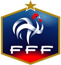
The design above is the logo for the French Football Federation, the organization that organizes professional football (soccer) in France. The logo is one of my favorites because the color scheme, balance, and beauty that the design exudes is very cool. The logo has a golden hexagon border which encases the blue/red background of the image. At the top of the logo is a golden star which closes the hexagon together. The main part of the logo besides the FFF text is the rooster or 'le coq' which is the national animal of France, similar to the bald eagle in America. The rooster is intended to embody the fighting spirit of the French team. The eagle is colored silver with red hair. The FFF letters also use the same color scheme. Besides the colors and balance of the image, I think that overall the logo is very visually pleasing. The shade of the colors blend together well, and when put on the backdrop of the French national jersey, the logo looks great.
Sunday, November 8, 2009
Michelangelo Antonioni's The Passenger (1975)
This past week I was able to watch Michelangelo Antonioni’s The Passenger starring Jack Nicholson, who at the time was the leading star in Hollywood. The film itself is noteworthy simply because of its director, Antonioni, whose authorial style has to be taken into consideration to understand and appreciate what the film tries to do. Antonioni for the most part is considered an Italian Neorealist art film director, which means that his films differ greatly from other styles. Most importantly, the viewer must go into the viewing of the film with an open mind, free of the expectations that the average Hollywood film has, featuring logic, drama and romance. Antonioni’s work is a mixture between the authentic realities he is trying to visualize along with his own artistic style of filmmaking that can only be understood as an overall piece of art on screen.
In The Passenger, Jack Nicholson’s character David Locke is discontent with his life as a war journalist and decides to assume the identity of a dead tenant in the hotel he is staying in, and consequently cannot escape the ghosts of his past as well as the unhappiness he previously felt. The film is shot on 35mm at 1.85:1, but is almost completely lit with natural light that comes from the African daylight sun. This constant brightness allows the viewer to almost feel the never-ending heat that Locke experiences. When filming, the director used all sorts of shots but for the most part, does not feature any point-of-view shots, as a way of expressing Locke’s emotion, instead, mostly everything is kept at medium close up and further, and even with this style, the film still features lengthy portions that contain very little dialogue, and subsequently do not need any. The director is able to tell all that needs to be told with visuals. One of the most intriguing components of film is the way the camera moves away from the action on screen during certain shots. It becomes a recurring theme of the film. A shot may begin with Locke in his hotel room sitting at a table with no shirt on, and the camera will pan to the left to look at what seems to be a pointless spot on the wall, or an open window. The camera then pans backs to the right and Locke is standing up now, reading a piece of paper, and wearing a shirt. The camera pans and in the process, the viewer misses the action of Locke doing something. At first these types of movements are not that noticeable, but they grow as the film moves on, and the second to last scene, one of the most famous in movie history, exemplifies this artistic technique with a moving camera shot that takes the viewer away from Locke in the final moments of his life, and returns a minute later to find him dead. The style of shooting makes the film much more interesting than just the plot and this is the point; the film is art and needs to be viewed as a piece of art to be appreciated, thus the plot takes a backseat to the film techniques and acting. Antonioni has long been lauded for his talent and innovative style, and The Passenger is sound example of his many skills.
In The Passenger, Jack Nicholson’s character David Locke is discontent with his life as a war journalist and decides to assume the identity of a dead tenant in the hotel he is staying in, and consequently cannot escape the ghosts of his past as well as the unhappiness he previously felt. The film is shot on 35mm at 1.85:1, but is almost completely lit with natural light that comes from the African daylight sun. This constant brightness allows the viewer to almost feel the never-ending heat that Locke experiences. When filming, the director used all sorts of shots but for the most part, does not feature any point-of-view shots, as a way of expressing Locke’s emotion, instead, mostly everything is kept at medium close up and further, and even with this style, the film still features lengthy portions that contain very little dialogue, and subsequently do not need any. The director is able to tell all that needs to be told with visuals. One of the most intriguing components of film is the way the camera moves away from the action on screen during certain shots. It becomes a recurring theme of the film. A shot may begin with Locke in his hotel room sitting at a table with no shirt on, and the camera will pan to the left to look at what seems to be a pointless spot on the wall, or an open window. The camera then pans backs to the right and Locke is standing up now, reading a piece of paper, and wearing a shirt. The camera pans and in the process, the viewer misses the action of Locke doing something. At first these types of movements are not that noticeable, but they grow as the film moves on, and the second to last scene, one of the most famous in movie history, exemplifies this artistic technique with a moving camera shot that takes the viewer away from Locke in the final moments of his life, and returns a minute later to find him dead. The style of shooting makes the film much more interesting than just the plot and this is the point; the film is art and needs to be viewed as a piece of art to be appreciated, thus the plot takes a backseat to the film techniques and acting. Antonioni has long been lauded for his talent and innovative style, and The Passenger is sound example of his many skills.
Subscribe to:
Posts (Atom)